Understanding colour theory transforms how we approach sustainable home design, particularly when working with natural materials from Indonesian artisans. Bamboo, rattan, and handwoven textiles offer rich palettes grounded in earth’s authentic hues—colours that create warm, inviting atmospheres whilst honouring organic origins and conscious consumption principles.
The Natural Colour Spectrum
Natural materials present inherent colour ranges shaped by growth conditions, processing methods, and traditional treatments. Bamboo varies from pale cream through honey gold to deep amber, each shade offering distinct atmospheric qualities. Rattan displays similar warmth with slightly cooler undertones, whilst handwoven textiles span earth’s entire palette through plant-based dyes.
These organic colours possess depth impossible to replicate synthetically. Subtle variations within single pieces create visual interest that mass-produced items lack. This complexity allows natural home accessories to anchor colour schemes whilst maintaining versatility across changing design preferences.
Warm Neutral Foundations
Building warm atmospheres begins with establishing neutral foundations using natural material tones. Bamboo home decor in honey and caramel shades creates inviting bases that pair beautifully with both cool and warm accent colours. These artisan-made neutrals possess inherent warmth absent from grey-based contemporary neutrals.
Layer various natural tones to build depth—lighter bamboo pieces against deeper rattan creates dimensional interest through subtle contrast. This monochromatic approach using handcrafted home accessories establishes sophisticated warmth without requiring bold colour choices, perfect for those embracing minimalist aesthetics.
Natural neutrals reflect light differently than painted surfaces, introducing organic luminosity that changes throughout the day. This dynamic quality keeps spaces feeling alive and responsive to natural rhythms.
Complementary Colour Relationships
Pair bamboo’s warm golds with cool blues for classic complementary contrast. Indigo-dyed handwoven textiles against natural bamboo create balanced tension—the warmth and coolness enhancing each other whilst maintaining harmony. This relationship works particularly well in living spaces where both energy and calm prove desirable.
Terracotta and rust tones complement bamboo’s yellowy warmth through analogous relationships on the colour wheel. These earth-derived hues feel instinctively harmonious, creating cohesive sustainable home textiles and natural home decor combinations that reference shared origins in soil and plant life.
The Psychology of Natural Colour
Earth tones inherent in Indonesian artisan pieces promote psychological wellbeing. Warm bamboo colours evoke security and comfort, whilst cooler rattan tones provide balance preventing spaces from feeling heavy. Understanding these emotional responses allows intentional atmosphere creation through strategic material selection.
Organic colours lack the stimulation of bright synthetic hues, making them ideal for creating restful environments. Bedrooms and meditation spaces particularly benefit from natural material palettes that promote calm without feeling cold or clinical.
Texture as Colour Enhancement
Natural materials introduce texture that influences colour perception. Handwoven textiles with raised patterns catch light differently than smooth bamboo surfaces, creating visual variety within similar colour ranges. This textural dimension adds complexity to monochromatic schemes, preventing flatness whilst maintaining cohesion.
Rough-hewn rattan appears darker than smooth-finished bamboo at identical colour values due to light absorption differences. Consider these textural effects when combining eco-friendly home decoration pieces—balance rough and smooth, matte and subtle sheen for optimal visual interest.
Seasonal Colour Transitions
Natural materials’ neutral palettes allow easy seasonal colour transitions through textile layering. Winter might feature deep indigo and charcoal handwoven throws against bamboo foundations, whilst spring welcomes sage and cream. The sustainable home accessories remain constant whilst smaller textile pieces adapt, embodying conscious consumption through versatility.
This approach reduces need for complete seasonal overhauls, instead allowing subtle shifts that refresh spaces without waste. Investment in quality handcrafted home decor that transcends trends becomes economically and environmentally sensible.
Creating Depth Through Tonal Variation
Achieve sophisticated warmth by combining various tones within the natural material spectrum. Light bamboo baskets, medium-toned rattan furniture, and darker woven textiles create layered depth that invites visual exploration. This tonal approach maintains cohesion whilst preventing monotony.
Consider undertones carefully—some bamboo leans yellow whilst certain rattan carries pink or grey notes. Harmonizing these subtle differences creates polished results, whilst clashing undertones can feel discordant despite similar colour values.
Accent Colour Selection
When introducing accent colours beyond natural tones, choose earth-derived hues that complement rather than compete. Moss greens, dusty pinks, and muted ochres reference natural dye sources traditionally used in Indonesian textiles, creating authentic connections between artisan-made products and contemporary styling.
Limit accent colours to one or two shades, allowing natural material tones to dominate. This restraint prevents visual chaos whilst allowing personality expression through carefully selected handwoven cushions or decorative pieces.
Lighting's Impact on Natural Colours
Natural materials respond dramatically to lighting changes. Warm incandescent or LED lighting enhances bamboo’s golden tones, creating cosy evening atmospheres. Daylight reveals cooler undertones, maintaining freshness during daytime hours. Consider this variability when selecting sustainable home design pieces for specific rooms.
Position bamboo home accessories near windows where natural light showcases grain patterns and colour variations. Conversely, place darker rattan pieces in dimmer areas where they absorb and soften light, creating intimate pockets within larger spaces.
The White Space Balance
Natural material warmth requires adequate white or light neutral space for balance. Avoid overwhelming rooms with dense organic textures—instead, pair handcrafted Indonesian pieces with white walls, light wood floors, or pale textiles. This breathing room allows natural colours to register properly whilst preventing heaviness.
The 60-30-10 rule applies: 60% neutral background, 30% natural material tones, 10% accent colours. This proportion creates balanced warmth that feels intentional rather than cluttered or dark.
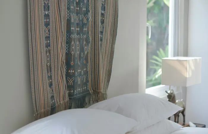
Cultural Colour Significance
Indonesian textiles often incorporate colours carrying cultural meanings—indigo representing depth and wisdom, red signifying courage, yellow embodying majesty. Understanding these associations adds layers of meaning to colour choices, connecting aesthetic decisions to rich cultural heritage.
Display pieces highlighting traditional colour combinations educates whilst decorating, transforming sustainable home textiles into conversation starters that honour artisan traditions and conscious consumption values.
Explore our collection of Indonesian natural material pieces, where authentic earth tones create warmth, depth, and timeless beauty in contemporary homes.